This article has been made into a movie: GENOCIDE Just Starting?! US Death Spike Intensifies! Mass Die-Off Is Accelerating In Younger People
The latest released data & charts from USMortality.com last week on Twitter is extremely disturbing. The already tragic trajectory of the excess deaths, measured in 52 week moving average of excess death, is getting worse and worse in all age groups, except 85+. But the mortality data from all groups since 2020 is absolutely gut wrenching
Here are the charts enlarged:
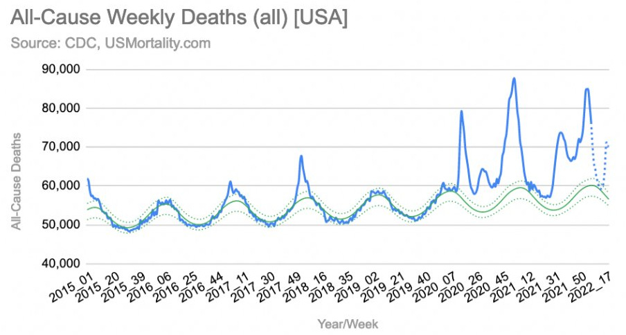
The first chart shows all US deaths for the last 7 years, where a cyclic pattern is hugely broken through in 2020 to present.
The above chart shows the excess deaths, which is basically the actual number of deaths minus the expected number of deaths. This data that includes all ages tells a very sad story of mass unexpected deaths over the past two years. The trend shows no signs of slowing down and may actually be getting worse. In the following charts we’ll delve into a death trend analysis by age bracket
The above chart of 0-24 excess death contains perhaps the most concerning signal from this devastating update. In addition to a steadily above baseline excess mortality through Q3 2021, Q4 2020 & FY 2021, the last few data point show a massively elevated excess deaths rate upwards of 40-50%! What is happening to the children and young adults and which direction is this chart headed in?
The above chart shows all US deaths 25-44 over the last 7 years on a weekly basis. You can see a huge increase in the 2021. Again, the trend is beyond disturbing
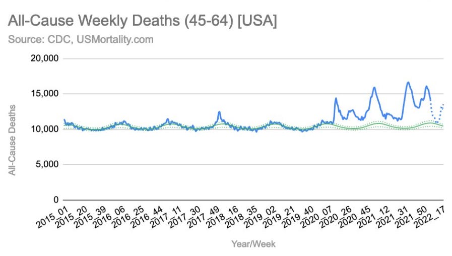
The above chart shows all US deaths 45-64 over the last 7 years on a weekly basis. Again, like the younger age cohorts, we see a sustained elevation of the weekly deaths.. and the rate seems to be trending higher. Again, a very elevated 2021
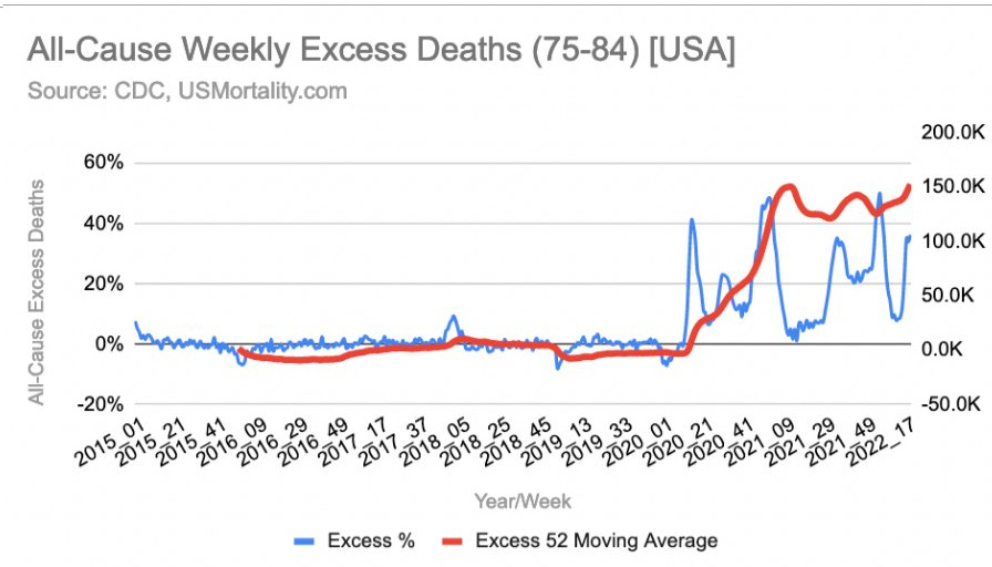
The above chart show the same 2 year mass, unexpected dieoff. This time an increase trend of the 52 week moving average is another huge cause for alarm.
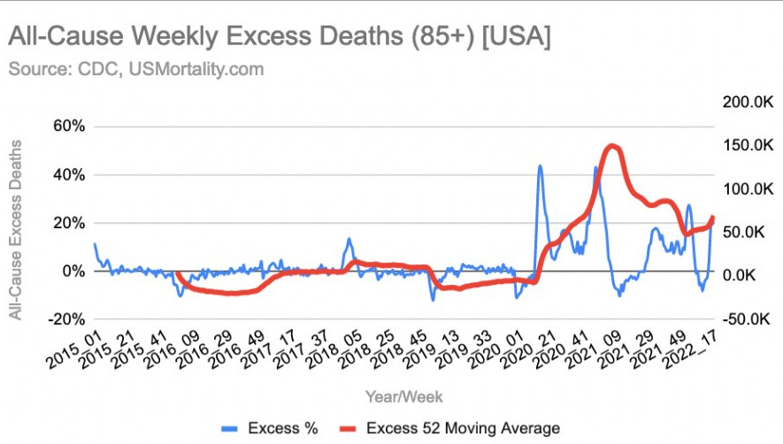
While the excess death rate 52 for 85+ is a bit lower than the high peak at the end of 2020 and through 2021, the 52 week moving average of excess death shows we are still in horrible nightmare territory
PULS Data Indicating 2.27x Risk Of Acute Coronary Syndrome After 2 mRNA Vax Shots
I can’t help but be reminded of the article in American Heart Association’s journal: Abstract 10712: Observational Findings of PULS Cardiac Test Findings for Inflammatory Markers in Patients Receiving mRNA Vaccines https://www.ahajournals.org/doi/10.1161/circ.144.suppl_1.10712 They tested 566 patients aged 28 to 97 before and affter the mRNA shots and found very alarming results in a test that predicts severe cardiac risks to come in the next 5 years:
These changes resulted in an increase of the pre vac PULS score of predicted 11% 5 yr ACS risk to a post vac PULS score of a predicted 25% 5 yr ACS risk
That is a 2.27X increase in this group of 566 patients after 2 spike protein eliciting mRNA shots. Keep in mind this data was from just after 2 of the shots that many have now taken 4 of, with no ending in sight.
Ex Pfizer Chief Scientist Dr. Michael Yeadon: Mass Murder With Vaccine Passports/ Top Up Vaccines?! https://www.bitchute.com/video/nrRTMMXYi9Nc/
2,900,000 New US Disabilities Onset Post Vax Launch, Drastically Reversing Prior Downward Trendline https://www.bitchute.com/video/I4LedJNFVFTl/
Dr. Charles Hoffe: Majority Of Tested Patients Have New Onset Clotting After Vaccine: https://www.bitchute.com/video/mZHA2u71pBwk/
Dr Bhakdi: Vaccines Are Killing Us! Killer Lymphocytes Invading Hearts & Lungs Of Vaxxed People: https://www.bitchute.com/video/6CYsxkxaGYvA/
When the oligarchs paid to have the phrase “flatten the curve” inserted into popular culture, they wouldn’t happen to have been referring to the population curve, would they?


Thank you Tim, as always!